Do’s and Dont’s of Fonts in Design
Affiliate Disclosure: As an Amazon Associate I earn from qualifying purchases. Additionally, I may get commissions for purchases made through other affiliate links in this post.
Today, Sarah Guilliot from Sarah Design is generously giving Cutting for Business readers a crash course in designing with fonts. Sarah is a Photoshop guru who loves creating mockups and teaching others the ins and outs of using Photoshop. I’m turning it over to Sarah:
Hi Cutting for Business readers! You might love the huge variety of beautiful choices, but at the same time are overwhelmed by that variety. It’s hard enough when you’re writing a document, but if you’re designing something creative? What do you do?! You scour Pinterest looking for font pairings and find some you love, only to discover you don’t own that gorgeous font and have to use something you already do own instead. How do you know if it looks good? How big should it be? What’s next?
It’s not as bad as you think, and you don’t need to be a pro designer to do this. Follow the guidelines below and you’ll be designing confidently with fonts in no time!
Number of Fonts
- Don’t use too many – If I were to pick the number 1 rule out of all of these to follow, this would be the one. Too many fonts will ruin your design fast! You want to limit the number of fonts in a design to 2, maybe 3, max. I usually stick to 2. Any more than that, and your design starts to look very disjointed, like you couldn’t make up your mind. You want your design to look intentional, and limiting your fonts helps with this.
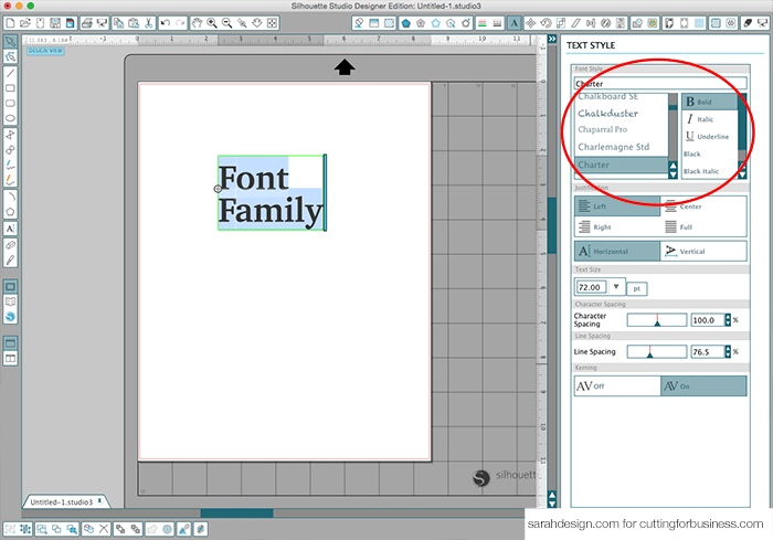
- Do explore font family variations – Most fonts come in a variety of different weights, from super skinny and thin, to thick and bold. Look in the dropdown list for a given font in your software and you’ll be able to see what variations there are to choose from. Sometimes this is all you need; one single font family with several variations (generally thick and thin).
Script Fonts
I LOVE script fonts. When I started my printables shop, nearly everything I created had a script font in it, and I was constantly snagging new free script fonts off of Font Squirrel, or buying them on Creative Market or The Hungry Jpeg. Not all script fonts are built the same though, and you need to think about a few things when choosing one for your design.
- Don’t use all caps – Capital letters are the script font’s enemy. So, keep all caps scripts out of your headlines and paragraphs. All caps (unreadable):

Regular (winner!):

Script fonts in art.
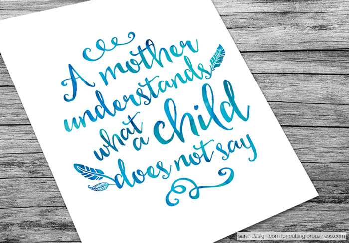
Script fonts are typically best used in titles, with plainer text below. But that’s for documents…art is another story! You can use script fonts for a whole phrase or saying if you choose the font carefully, make sure it’s readable, and that it suits the design.
In the example below, I chose one script font to use for the entire piece. I started with all the words at the same size, then chopped them apart and arranged them. Then I felt that “child” needed more emphasis so I made it larger, and reduced the size of “what a” to fit nicely next to it. After that, I added swirls and feathers. All the shapes are rounded with no hard edges, which reinforces the maternal feel and the watercolor blue ties it all together.
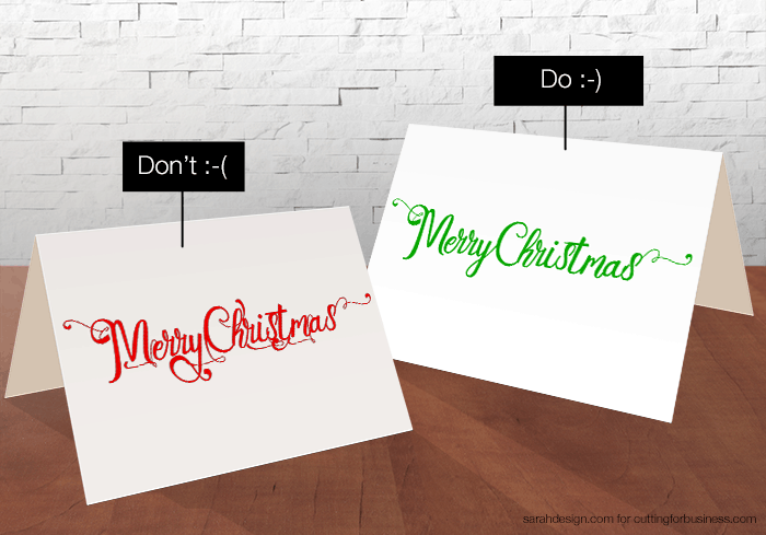
- Don’t over-use swashes and swirls – Don’t get me wrong, I love a good swash! In fact, I used some swashes in my logo on my website at Sarah Design. Below is an example of swashes gone wrong. Remember also that if your swishy font has very thin parts, this may be difficult to cut on your Cricut or Silhouette machine so do a test cut before designing a hundred of these.
Serif and Sans-Serif Fonts
Apart from script fonts, you may have heard of serif and sans-serif. Or you may be thinking “Are you nuts, Sarah? What the heck are those?” 🙂 It’s actually very simple.
Serifs are what you call the little “feet” that are at the bottom of the letters in some font families. Times New Roman (we all know that one, right?!) is a Serif font. “Sans” means “without”, so sans-serif fonts are the ones without those little feet. You know…the simple ones we’ve been using on our computers all these years. Arial is a Sans-Serif font.
Typically you can use either of these in body copy. Take a look at a book and you’ll see what I mean. As I mentioned in the script section above, you most likely wouldn’t use a script font or all caps on paragraphs of text in a book or article. Serif and Sans-Serifs are your go-to for that.
- Avoid your caps lock key – If you want to capitalize words and phrases, don’t use your caps lock key because if you change your mind, you have to re-type everything. Instead, go into the type settings in your software and there will be a special uppercase button that does this for you! It’s amazingly handy to be able to switch back and forth between caps and no caps while you’re testing out your ideas.
Context and Mood
When you’re planning a project that includes text, think about the mood you want your typography to convey. Is it soft and encouraging? Bold and strong? Does it fit a holiday? Deciding on your style in advance will save you loads of time when you’re designing.
The right font can make or break your design so take a few minutes to explore a few and find just the right one. If you want to make a Christmas Card, you probably don’t want a scary looking Halloween font in there, and vice versa.
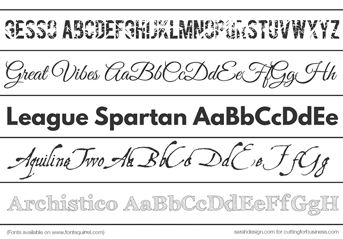
- Don’t judge a font by its name – On the flipside…don’t let the name of a font determine the mood for you! Maybe that Halloween font called “slaughter” isn’t scary at all, but looks romantic and is perfect for Valentine’s Day. Or that the “grungy font” section is filled with promising choices for your kid’s birthday. Spend some time exploring. Use your eye!
Modify
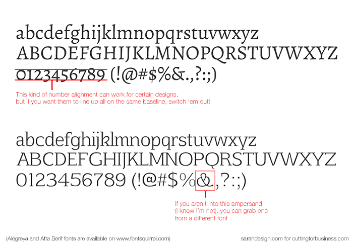
- Cut and paste, when needed – Sometimes your favorite font has weird stuff in it – switch that stuff out! I’ve run into many a font that looked amazing but then the punctuation looked ridiculous. Sometimes in the numbers there’s that one number that sits lower than all the others…what’s up with that? If you run into this, go grab that quote or number set from another similar font and use it instead.
- Check your spacing – Kerning (sometimes called “character spacing”) is the space between two letters. Leading (sometimes called “line spacing”) is the space between lines of text in a paragraph. Sometimes the settings built into a font don’t look right. Like a capital ‘Q’ is way to far away from the ‘u’ next to it. Kerning and Leading are adjustable, so if you want to tweak that spacing, go right ahead. Just be careful you don’t over-tweak.
Contrast
Pairing fonts successfully, happens when you use contrasts like these:
- Size – a large headline with small subhead.
- Weight/thickness – a Bold or Black version of a font family paired with a Thin, Light, or Regular version.
- Style – Script paired with straight or angled sans-serif font.
- Color/opacity – Dark black vs. light gray, pastels vs. saturated colors, see-through vs. solid.
Scripts pair wonderfully with sans-serifs.
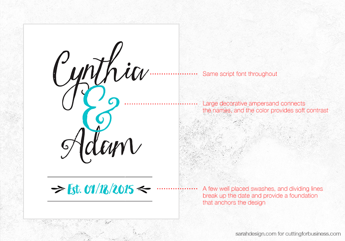
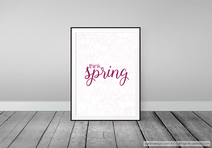
My favorite style of contrasted font pairs is when the most important word is a large script font, and the accompanying text is small and thin (like in the “think spring” example below). This is a wonderful way to put together a logo for your business. There are many other contrasted pairings besides script + sans-serif, but this is a tried and true recipe you can confidently use in your typographic designs.
- Don’t pair scripts with more scripts – Scripts upon scripts are way too busy and confusing to the viewer. When it’s not clear what to focus on, your eye bounces all over the design and it leaves you with a feeling of unrest. So if you’re using two fonts in a design, only one of them should be a script font.
Alignment
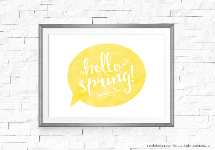
- Use shapes for emphasis or effect – The talk bubble in this “hello spring” print gives a clear indication of what the focus is here in this image, and since the message says “hello”, that shape makes perfect sense.
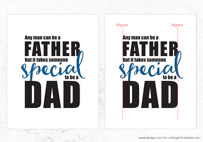
- Line ’em up – If you’re looking at a block of copy and things seem off to you, it’s probably because they aren’t aligning right. You can usually draw a guideline with your software, or draw a line with your drawing tool to help you see where things should go. The Father’s Day design below shows a box shape for emphasis on “DAD”, with text above. You might think the text above should be on the same edge as the left side of the box, but really it shouldn’t. See how the two alignments compare? The text above needs to align with the “DAD” text below.
- Fresh perspective – After you’ve aligned as best you can and laid out your page, take a few steps back and view your design from afar. Still look balanced? You can also use a mirror to reassure yourself that a design is good. I have done this many times. I will print my design out or pick up my laptop, head to the nearest wall mirror and hold it up so I can see its backwards reflection. It’s surprising what flaws this will reveal. Try it for yourself!
Break the rules
Sometimes things that are on the “design-no-no” list are just the thing you want in your design, especially if it’s a creative artistic piece. So break those rules if you need to!
Now that you’re font experts, you’ll no doubt be filling your shop with new designs. Check out my FREE EMAIL COURSE: 7 Days to Better Etsy Images where I’ll teach you to create gorgeous product mockup images that do all the selling for you. See you there! Sarah Guilliot, Sarah Design
WOW, what a great way to start our discussion on designing! A huge thank you to Sarah for sharing these amazing design tips with Cutting for Business readers. If you enjoyed Sarah’s amazing tips and knowledge, be sure to take her up on her free email course. Don’t forget to thank her for stopping into Cutting for Business by pinning the image below or sharing it on your favorite social media network – just hover over it.
Since 2015, Christine Schinagl has been helping crafters start and run craft businesses through her blog, Cutting for Business. As a Silhouette and Cricut crafter herself, she has a unique take on what works and what doesn’t work in the craft business world. She also enjoys teaching other crafters how to create digital SVG designs, available through the Design with Me series.
